It was Color Theory class in college that really made me appreciate the world of color we live in. Learning how those colors play off each other was striking to me, but even more important was how color affects us as individuals daily. We take the beauty of color we see every day for granted. It’s everywhere—in our homes, our commute to work, our jobs, entertainment, the food we eat…literally, everywhere.
Color has an incredible impact on our moods. Have you ever noticed how many restaurants have red or orange in their interiors or perhaps the artwork with those colors hanging on the walls? Did you know that these colors actually entice people to want to eat?
Red is a very intense, rich color. Because of this, it is not recommended for spaces where there may be high levels of anxiety or worry (i.e., hospitals, doctors’ offices, etc.). On the other hand, blue and green are calming colors. Next time you’re in a hospital or medical office, notice the materials and textiles used in that space. In places where we need a calming effect the most, you will almost always see blue or green as the choice of colors used for these interior spaces. Neutral colors can also have a calming effect, especially if it is a monochromatic design theme. Other colors, like purple, can be anxiety-producing but also calming as well! The more blue a color contains, the more calming the effect.
Yellow is cheery and fun and can boost almost anyone’s mood. I mean, who doesn’t love the glow of the sun and the warmth it brings on a sunny day? Color can truly affect our moods, as can natural light. Have you noticed a difference in your mood on a sunny day versus a cloudy, gloomy one? What about when it is dark at night? Or when the morning sunshine streams through your windows? Light can also affect our moods and can affect color in our homes as well. Do you ever desire to open the curtains in the morning when the sun is dawning a new day? It feels good – inside and out – to bask in the natural warmth of the sun! The colors of your interior space can either reflect the light or absorb it.
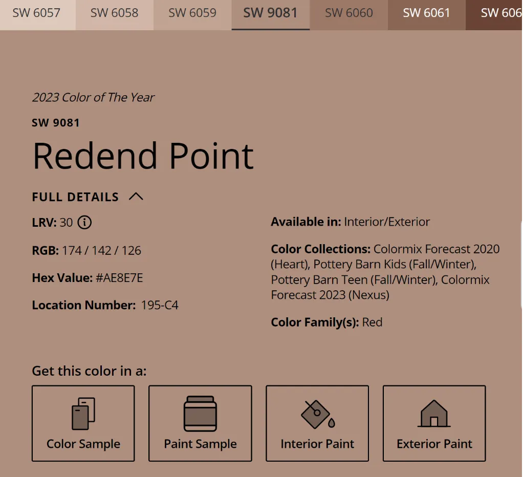
Darker colors tend to absorb light. They have a low light reflective value (LRV), meaning they don’t reflect light as much as a lighter color with a higher LRV will. Look at a paint deck strip sometime and notice the varying shades (light to dark) of the hue (color). The darker hues have a lower LRV, and the lighter hues have a higher LRV. Usually the color strip samples from paint stores will have a percentage marked on the back stating the LRV of each color. In the picture below, Sherwin-Williams color “Redend Point” has an LRV of 30. If we have an LRV scale of 0-100, with 100 being the darkest color, “Redend Point” will be somewhere in the middle.
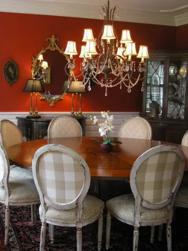
Check out the lighting in this next picture! There is a lot of natural light bouncing off the lighter painted walls, so this color is probably more similar to an LRV of 10 or less.
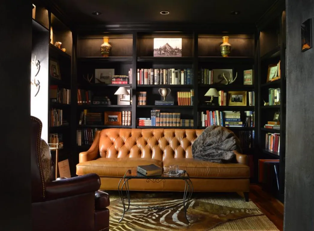
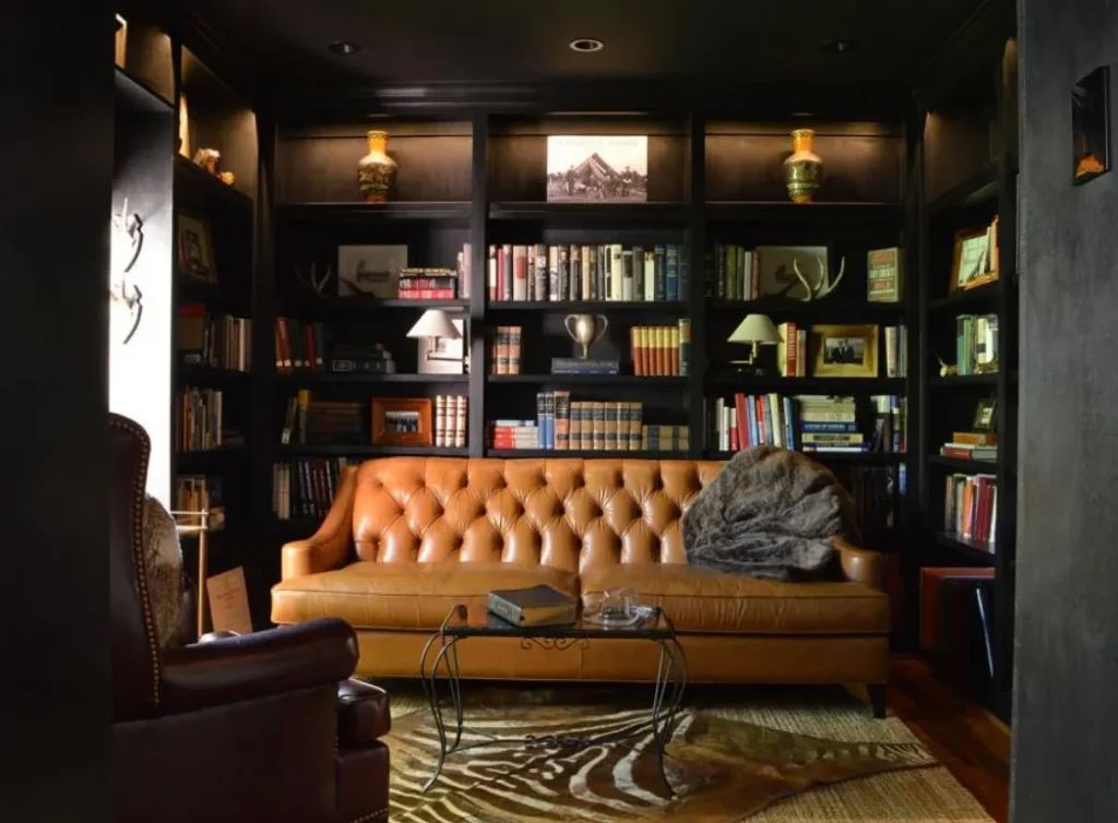
In the next picture, you can see how the dark walls (with a higher LRV) absorb the natural light. There is not much reflection, and yet, the dark walls create a very dramatic feel to the room.
When designing for our clients at Aslan Design & Build, we consider who our clients are, what they find desirable for their spaces, and how to make the atmosphere the best reality of their dream homes. We take many things into consideration in this process, including, but not exclusively, color and natural lighting. Choosing the best colors to complement the specific lighting of the space can be the key to creating an atmosphere that complements who the client is while encouraging them to live better lives through the interior design of their spaces.